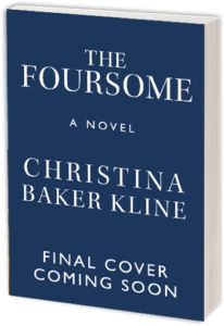
Everyone says that you shouldn’t judge a book by its cover, but of course we all do. Presented with an overwhelming array of options, a reader has limited ways to figure out which book on the shelf is worth $20+ – not to mention hours of precious time. The best covers, I think, reveal much about the tenor and style of the book while stimulating the browser’s curiosity. (Recent covers that spring to mind include Lush Life, by Richard Price; Eat, Pray, Love, by Elizabeth Gilbert; The Story of Edgar Sawtelle, by David Wroblewski; and memoirist and book designer Julie Metz’s cover for her own book, Perfection.)
Some of my own book covers have been more successful than others. “Cover consultation” is a standard part of most writers’ book contracts, which means, essentially, that the publisher presents the writer with one or two options, and if the writer strenuously objects they may be willing to try again. Ultimately, though, the publisher usually makes the final decision, saying – with justification – that they have more experience, understand the market better, and are, after all, in the business of selling books. With my own covers, I won some and lost some; usually there was some kind of compromise. (You can see the covers here and judge for yourself. Which ones work best?)
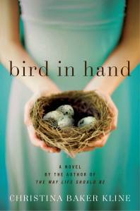
When my editor and I began talking about the cover of Bird in Hand, I didn’t have a specific thought in mind. We’d recently changed the title, and I was still stuck on ideas that had to do with metaphorical representations of a four-way stop. So without any input from me, they came up with this option:
Isn’t this a beautiful image? The saturated colors are lovely; the typeface is strong but simple, and the picture is arresting. But I felt that it was too, well, female – and perhaps a bit literal (yep, those birds are indeed in her hands). My editor wrote, “Our sales force likes this jacket very much; they feel that, as a marketing tool, as a way to catch people’s attention and get them to pick it up from tables at bookstores, it’s very effective.” And I completely understood that. But I still didn’t think it was right for this book. Bird in Hand is about four people with complex and clashing emotions, and I wanted the image to convey unrest. The sales force disagreed, but my editor was willing to go back to the drawing board. (This image is now the cover of the international edition.)
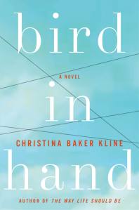
The next three covers they sent were wrong for all different reasons:
 I understood what they were doing here: four characters, four relationships, crossed wires. But as a friend asked, “Is this book about a concentration camp?” Here’s the next one:
My novel takes place in New York and its suburbs. To me, this looks like a bucolic Midwestern building in a field. And then there’s this:
Which I admit is a bit better. The problem, ultimately, was that these covers struck me as generic. They didn’t convey anything in particular about my novel.
What often happens is that the writer may not have a clear idea of what she wants at first, but being presented with ideas that don’t seem right clarifies her opinion. (This is, of course, no fun for any art director.) So after getting all these options, I put some hard work into figuring out what I did want, as opposed to what I didn’t. Bird in Hand is about the dissolution of a marriage (among other things), so I wanted to picture a domestic scene with something slightly awry. I envisioned a marital bed in the foreground—but with an unsettling component, something “off.” I imagined a window with a surprising view or an odd picture on the wall.
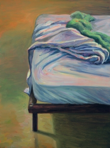
I was inspired by two paintings that hang on the walls in my study: “Beginning” by Laura Tryon Jennings, a rendering of the room I stay in at my parents’ house in Bass Harbor, Maine, in the summer – and “Rumpled Sheets” by Jessica Dunne, which depicts a bed at the VCCA, the artists’ colony where I met this wonderful artist. (She did this painting while we were there.)

After discussing all of this with my editor, she went to the art director. Several weeks later, they came back with this:
I knew immediately that this was the one. It retains the color palette and typeface of the first cover but has a whole different feel. I love the bed, with its carefully folded back covers, as if someone got up and out. These sheets clearly aren’t rumpled in passion. I love the odd little Audubon-like photo-realist picture high on the wall. (What’s it doing there?) I love the juxtaposition of the soft orange blanket with the cool, shadowed sheets. This cover, to me, has mystery and drama and strangeness, and perfectly conveys the mood of my novel.
But what do you think? I’d love to know!
