Sign up for Christina’s Newsletter

Christina Baker Kline

Author Website

  • Books
    • Please Don’t Lie
    • The Foursome
    • The Exiles
    • A Piece of the World
    • Orphan Train
      • Orphan Train Girl: The Young Readers’ Edition of Orphan Train
    • Other Novels
      • Bird in Hand
      • The Way Life Should Be
      • Desire Lines
      • Sweet Water
    • Nonfiction
      • Always Too Soon
      • About Face
      • Child of Mine
      • Room to Grow
      • The Conversation Begins
  • Events
  • NEWS
  • Other Writing
  • About
    • Bio
    • FAQs
    • Contact
    • Photos
  • Newsletter

September 15, 2009 By bakerkline

Q&A with Graphic Designer Julie Metz: Judging a Book by its Cover, Part 1

The inside scoop on what makes a successful book cover – and why it matters.

Several weeks ago I wrote about the jacket cover for my new novel, Bird in Hand.  So many people responded with stories about their own covers, and questions about the process, that I asked Julie Metz, a book designer who has worked with all the major publishers (and who also recently wrote a memoir, Perfection) to weigh in.  We talked about how she designs covers, what kinds of covers are most successful, and what writers should know about how to get the covers they want.  (Part 2 of this conversation will run later this week.)

Thanks for joining us, Julie.  How do you approach the process of designing a book cover? First I try to get hold of a manuscript.  If this isn’t possible I settle for a tip sheet or an outline. Editors often provide useful information such as competitive titles in the marketplace, and occasionally I’ll be sent an author questionnaire. I try to factor in all these influences before I begin, then take a deep breath. Every project is a journey.

little childrenI read a piece the other day about how the cover for Tom Perrotta’s novel Little Children spawned a dozen or so similar ones.  As a designer, do you consciously try to avoid colors, motifs, or trends that seem popular in a given moment, or do you embrace them? Trends are out there in the world, like the latest styles of shoes or jeans, so as a visual person you take them in whether you realize it or not.  Sometimes I embrace the trends, or am asked to embrace them, or rebel and reject them.  A book cover is essentially packaging, and as we all know, packaging is more important than ever.  It’s important to find a way to signal to the book buyer where this new title fits in, or, if it is truly original, that it doesn’t fit into any neat category.

What are some of your own most meaningful cover designs, and why? A good cover is a smart, clever idea executed in a way that is eye-catching.  It’s all about helping authors find readers – serving the content of the book in a way that will help a browser want to pick it up. You wouldn’t want to package the latest thriller the same way as this year’s big literary novel.  I have enjoyed working on spooky vampire gothic novels as much as I have enjoyed designing the cover for a terrific novel or poetry collection.

Here are a few examples, and the stories behind them:

The Dracula DossierThe Dracula Dossier is a fun read, and the cover was fun to design.  The challenge was putting together pieces from several images to make it all look like one universe.  The story takes place in London during the time of Jack the Ripper, and the theater plays a big part in the story. I think the curtain adds mystery and some information for the reader about the setting.

word comix 2The poems in Charlie Smith’s Word Comix are engaging and full of fantastic imagery, and I wanted to treat the cover as if the book were a novel.  The author suggested the Western element, and when I found this picture I knew my work was done.  I added some elements to give it a more gravity-defying feel.  I love doing hand-lettering whenever I can get away with it.

Pound coverWe designers live for the AIGA “50 covers 50 books” show, and I am proud that this Ezra Pound cover won a spot in the show.  As I mentioned, I love doing hand-lettering – and it seemed so appropriate for this collection of correspondence. I tried to give it an edgy, desperate feeling.

inheritanceBIGI hired a picture researcher to help me with the cover for Inheritance.  She had a friend whose mother had grown up in China at the right time, and there were family photos.  We did some hand-coloring, and I tried to channel my inner calligrapher.

The RomanticThe title of Barbara Gowdy’s novel The Romantic is somewhat ironic, so I wanted to find an image that showed the edgier, sharper side of love.

What’s your most “successful” cover? The Poisonwood BibleA book cover I wish I had been paid royalties for, because it has withstood the test of time:  The Poisonwood Bible by Barbara Kingsolver.  When the art director assigned the job, he said that the mission was to take the author out of what might be called “genre” fiction to something wider.  I read the book and loved it.  I purchased Bible paper and organized a photo shoot to create the book for the background. I chose elegant, classic type, as we all saw this novel as a modern classic. But the cover was still missing something.  At 2 am (this was long before I had a baby, and my freelancer hours were night-owlish), I was fretting over the design in progress. My then-husband said he felt it needed a human element.

I began thinking about the story, about how these five hapless Americans in the missionary family that narrate the novel might be seen by the indigenous people of the Congo, where the story takes place. I found a great book on art of the Congo and noted that they created wonderful drawings using stick figures that, even in their simplicity, revealed so much about character.  Inspired by this artwork, I created five stick figures of my own.  My art director, Joseph Montebello, loved the design and fought hard to get it approved. I think the cover really did help the book succeed. It’s a great book and would have been successful anyway, but I like to think that the successful packaging made a difference.
Metz, PERFECTIONWas it harder or easier than usual to design your own book cover?It was harder! I felt like I had so much on the line. I wrote a piece about this for the May 25, 2009 edition of Publishers Weekly titled “Double Duty,” a title that accurately sums up the emotions I experienced as I worked on the cover.

Filed Under: The Writing Biz Tagged With: book covers, creative process, design, Inspiration, Julie Metz, Little Children, Perfection, The Poisonwood Bible, Tom Perrotta

September 2, 2009 By bakerkline

“Frequently Bought Together”

To be linked even tangentially, even as part of an amazon.com promotion, with Richard Russo and Pat Conroy, two writers whose work and careers I admire (who also happen to be men) makes my day.  No, week.  Okay, it makes my year.  Is that so wrong?

Frequently Bought Together

Bird in Hand + That Old Cape Magic + South of Broad
Price For All Three: $48.53

Show availability and shipping details

  • This item: Bird in Hand by Christina Baker Kline
  • That Old Cape Magic by Richard Russo
  • South of Broad by Pat Conroy

Filed Under: Bird in Hand, The Writing Biz Tagged With: Bird in Hand, Pat Conroy, Richard Russo

August 31, 2009 By bakerkline

Anatomy of a Book Cover: Bird in Hand

Everyone says that you shouldn’t judge a book by its cover, but of course we all do. Presented with an overwhelming array of options, a reader has limited ways to figure out which book on the shelf is worth $20+ – not to mention hours of precious time. The best covers, I think, reveal much about the tenor and style of the book while stimulating the browser’s curiosity.  (Recent covers that spring to mind include Lush Life, by Richard Price; Eat, Pray, Love, by Elizabeth Gilbert; The Story of Edgar Sawtelle, by David Wroblewski; and memoirist and book designer Julie Metz’s cover for her own book, Perfection.)

Some of my own book covers have been more successful than others. “Cover consultation” is a standard part of most writers’ book contracts, which means, essentially, that the publisher presents the writer with one or two options, and if the writer strenuously objects they may be willing to try again. Ultimately, though, the publisher usually makes the final decision, saying – with justification – that they have more experience, understand the market better, and are, after all, in the business of selling books.  With my own covers, I won some and lost some; usually there was some kind of compromise. (You can see the covers here and judge for yourself. Which ones work best?)

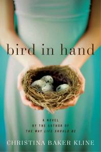
When my editor and I began talking about the cover of Bird in Hand, I didn’t have a specific thought in mind. We’d recently changed the title, and I was still stuck on ideas that had to do with metaphorical representations of a four-way stop.  So without any input from me, they came up with this option:Bird.in.Hand.cover.world

Isn’t this a beautiful image?  The saturated colors are lovely; the typeface is strong but simple, and the picture is arresting. But I felt that it was too, well, female – and perhaps a bit literal (yep, those birds are indeed in her hands).  My editor wrote, “Our sales force likes this jacket very much; they feel that, as a marketing tool, as a way to catch people’s attention and get them to pick it up from tables at bookstores, it’s very effective.” And I completely understood that. But I still didn’t think it was right for this book.  Bird in Hand is about four people with complex and clashing emotions, and I wanted the image to convey unrest.  The sales force disagreed, but my editor was willing to go back to the drawing board. (This image is now the cover of the international edition.)

The next three covers they sent were wrong for all different reasons:

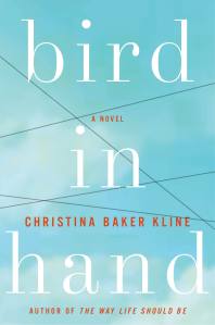
BIH.cover.wireI understood what they were doing here: four characters, four relationships, crossed wires. But as a friend asked, “Is this book about a concentration camp?”  Here’s the next one:BIH.cover.barn

My novel takes place in New York and its suburbs.  To me, this looks like a bucolic Midwestern building in a field.  And then there’s this:BIH.cover.trees

Which I admit is a bit better. The problem, ultimately, was that these covers struck me as generic.  They didn’t convey anything in particular about my novel.

What often happens is that the writer may not have a clear idea of what she wants at first, but being presented with ideas that don’t seem right clarifies her opinion.  (This is, of course, no fun for any art director.)  So after getting all these options, I put some hard work into figuring out what I did want, as opposed to what I didn’t.  Bird in Hand is about the dissolution of a marriage (among other things), so I wanted to picture a domestic scene with something slightly awry.  I envisioned a marital bed in the foreground—but with an unsettling component, something “off.” I imagined a window with a surprising view or an odd picture on the wall.

I was inspired by two paintings that hang on the walls in my study:  “Beginning” by Laura Tryon Jennings, a rendering of the room I stay in at my parents’ house in Bass Harbor, Maine, in the summer – and “Rumpled Sheets” by Jessica Dunne, which depicts a bed at the VCCA, the artists’ colony where I met this wonderful artist.  (She did this painting while we were there.)DunneJennings, LT

After discussing all of this with my editor, she went to the art director.  Several weeks later, they came back with this:BIH.final.cover

I knew immediately that this was the one. It retains the color palette and typeface of the first cover but has a whole different feel. I love the bed, with its carefully folded back covers, as if someone got up and out. These sheets clearly aren’t rumpled in passion.  I love the odd little Audubon-like photo-realist picture high on the wall.  (What’s it doing there?) I love the juxtaposition of the soft orange blanket with the cool, shadowed sheets. This cover, to me, has mystery and drama and strangeness, and perfectly conveys the mood of my novel.

But what do you think?  I’d love to know!

Filed Under: Bird in Hand, The Writing Biz Tagged With: "Lush Life", Bird in Hand, Book Cover, creative process, Inspiration, Jessica Dunne, Laura Tryon Jennings, Perfection, The Story of Edgar Sawtelle, VCCA

August 20, 2009 By bakerkline

Guest Post: Chad Taylor on Why Writers Should Care about Twitter

Tips on Networking 140 Characters at a Time, From the Guy Who Brought Me Pizza Oncetwitter_logo

(Not really.  I began following Chad Taylor on Twitter after reading his witty repartee with writer Susan Orlean.  Awed by his ability to be insightful, pithy, and clever within Twitter’s haiku-like restraints, I invited him to write a post revealing the secret of his success.)

I’m not a writer.

Well, using this blog as Exhibit A, a pretty strong case could be made to the contrary.  It’s true: I do write and it could even be argued that I don’t write badly.  But I’ve never published.  Nothing with a by-line or anything, at least.  I’m working on a book (who isn’t these days, right?) but I haven’t actually added anything meaningful to it in almost a month.  So, seriously, the guy who makes a living delivering pizzas is the last person who should be writing a guest blog trying to tell you anything about being a writer.  This irony is not lost on me.

What I am qualified to talk about, however, is why writers should use networking sites like Twitter, how they should use it to maximize its potential for them and what average Joes like me look for when we’re searching out new people to follow (read: new writers to read).

Everyone—or, everyone who isn’t delusional with self interest, that is—feels a little silly using Twitter at first because you’re walking the fine line between inundating your followers with every tiny detail of your lives (Carlos Mencia, I’m looking in your direction), or deciding that nothing you have to say is quite important enough, and not doing it at all.  But there are some easy guidelines.

First: Don’t resort to license plate shorthand or drastic measures like eliminating pronouns just to make a thought fit into 140 characters. In my own Twitter feed, I’ll often take an extra minute or two to restructure and re-write an update in a way that fits, rather than resort to a single “2” or “u.”  Iowa Senator Chuck Grassley‘s approval rating (perhaps coincidentally, perhaps not) dropped 15 points since the beginning of the year, which is about the same time that he started Twittering things like:

“We in congress hv been agitating china for Tibet for decades Right! We need to b just as agitated abt Chinese treatnent of Uighurs NOW” (8/9/09)

and

“Saw Glenn Beck on Fox last and got his pt abt govt and the missing airplane engine but I need explanation photograghic dishonestyWhere engin” (8/2/09)

and

“Plsnt conv. w sotomyr. 1 hr mtg. Look frwd 2 hrg and mre details abt recrd.” (6/8/09)

Great for the “unintentional hilarity” file; not so great for much of anything else.  Which brings us to the first reason that Twitter is good for the writer:  Twitter forces us to think and write succinctly.  In his book On Writing, Stephen King likes to say that a 2nd Draft = a 1st Draft – 10%, which is a quasi-mathematical way of saying that every idea can lose a little weight.  There are few real-world situations where a writer can hone the skill of economical communication and make professional and personal connections at the same time.  Hello, Twitter.  Compare the Senator’s updates above with San Francisco monologuist Josh Kornbluth: “I am feeling overwhelmed by the prospect of being away from my family – trying to breathe, listen to music, avoid pull of narcoleptic bed.” (8/6/09)

Or (is this even allowed?) from my own Twitter feed: “Putting coupons on doors. They could literally train a monkey to do this job, but don’t because a trained monkey would cost more.” (8/12/09)

Another tip for effective Twittering (I refuse to call the updates ‘tweets’) is to remember that people are following you not only because you’re (ideally) funny and interesting, but because you’re you. The good thing about Twitter from a follower’s point of view is that it’s a way for people who might otherwise never come in contact with you to get to know more about you.  The good thing from the Twitterer’s standpoint is that you have control over how deep that access goes.  The more you allow your followers to see, the more successful you’ll be.  Giving the people following you insight into your thought process; taking a self-deprecating look at minor faults; even just venting personal frustration all open you up to readers and allow them to connect more intimately than a dust jacket bio or blog interview could.

Great examples of this can be seen from New York based memoirist Janice Earlbaum: “FINALLY finished a long-overdue freelance piece; doing a smug little happy dance in my chair. Lunchtime!” (6/5/09)

The New Yorker’s Susan Orlean: “Spent last night talking to a nice editor of HuffPost, thinking she worked for Daily Beast & gossiping accordingly. She looked…puzzled.”

And MSNBC’s Rachel Maddow: “I think I might be the only Real Time with Bil Maher guest to have ever brought mom and dad as entourage to the backstage party.” (8/1/09)

Which, finally, brings us to the second big reason a writer should want to use Twitter: if applied properly, the networking possibilities are enormous. For beginning writers, Twitter can introduce you publishers, editors, other writers, fans, potential readers, reviewers…you see what I’m getting at.  For established writers, Twitter is an additional medium to advertise a new novel being released or, as in the case of our gracious host, to link to your own blog or website.  Each person who finds your Twitter feed is potentially a new set of eyes to look over a draft of that manuscript.  Or someone who knows someone at Harper Collins.  Or someone who might wind up loving your last novel and now can’t wait for the next one.  There’s work involved (when isn’t there?) but by following the right people and—more importantly—getting the right people to follow you, Twitter can be a powerful addition to your networking repertoire.  For an excellent example of this, look no further than this very page: this blog post is a result of a connection made over Twitter.

Chad Taylor (33, Capricorn)  has spent time as a pizza delivery guy, security officer, telephone salesperson and itinerant malcontent.  He is widely viewed as one of the great underappreciated writers of our time (citation needed) and is a frequent contributer to both his Facebook status bar and ESPN.com’s “user comments” section.  Voted “Great Catch” by his mother for 22 non-consecutive years.

Filed Under: Guest Blogs, The Writing Biz Tagged With: Chad Taylor, commercial, HarperCollins, networking, On Writing, Stephen King, Susan Orlean, Tweets, Twitter

  • « Previous Page
  • 1
  • 2
  • 3

COMING MAY 2026: THE FOURSOME

A literary historical novel set in Civil War-era North Carolina, based on a true family story and told from the perspective of Sarah Bunker, one of two sisters who married Chang and Eng, the famous conjoined twins…learn more

Follow on Substack

Subscribe

Connect with Christina

Contact
  • Facebook
  • Instagram
  • Twitter

Copyright © 2025 Christina Baker Kline · Site design: Ilsa Brink