 Women on Writing – or WOW! – is a buzzing hive of activity for, by, and about women writers and readers. In a freewheeling interview with Margo Dill, a WOW columnist and contributing editor, I talk about why I keep a blog, why I write first drafts on a legal pad with an old-fashioned micro-point Uniball pen, why I get bored when authors simply read their work aloud, why I don’t feel guilty about not being a morning person, and what I know is true (to paraphrase Oprah, and why not?) about being a writer. You can find the interview here.
Quick Link: Coffee With a Canine
 Recently I did an interview with Marshal Zeringue, a screenwriter who somehow manages to find the time to maintain three healthy blogs: The Campaign for the American Reader (“An Independent Initiative to Encourage More Readers to Read More Books”), Coffee with a Canine, and The Page 69 Test, which astute readers of this blog will recognize from an earlier posting. An excerpt of my recent conversation with Marshal – which includes earth-shattering revelations about how I write, where I work, my English Springer Spaniel, Lucy, and my favorite brand of coffee – is here, and if you can stand the cuteness, the entire interview is here. Woof!
Fear of the Blank White Page
 “The blankness of a new page never fails to intrigue and terrify me. Sometimes, in fact, I think my habit of writing on long yellow sheets comes from an atavistic fear of the writer’s stereotypic “blank white page.” At least when I begin writing, my page isn’t utterly blank; at least it has a wash of color on it, even if the absence of words must finally be faced on a yellow sheet as truly as on a blank white one. Well, we all have our own ways of whistling in the dark.”
Memoirist Patricia Hampl, in an essay called “Memory and Imagination.”
Guest Blog: Novelist Aimee Liu on Writing Like a Grown-Up
How a conversation with a successful magazine writer forced her to clarify her ideas about what and why she writes:
 Years ago I had coffee in NYC with a very talented writer who has traveled around the world writing articles for such publications as Esquire, The New Yorker, and Vanity Fair. He talked like a machine gun, shooting out thoughts faster than I could process them. At one point in the conversation I tried to explain why I’ve never felt comfortable with the idea of writing articles, and essays in particular. “I don’t ever quite believe people will want to read what I have to say.”
He shot back, “Boy, are you in the wrong business!” and moved on to the hundredth new topic of the morning.
I didn’t have a chance to qualify, to say that that’s why I feel it necessary to fictionalize, to heighten the impact and interest of whatever it is that I do choose to write about. But it didn’t matter. I believe my reticence, in the long run, helps my writing, just as for him, with his abundant hubris, it would be death. Our voices are entirely different, just as we are as people. We each will have our different readers, and lives. Our own levels of that curious commodity, “success.”
I do not think people will be interested in most of the things I have to say, but this is not because my life and mind are boring. I do not read the newspaper from cover to cover, and I especially don’t read most daily columns. Men talking about the observations they’ve made about their wives on the way to the dry cleaners, or women talking about how much they can learn about their husbands from their socks, or young women extolling on the trials and tribulations of pregnancy as if no woman in history has ever been pregnant before. Yes, these epiphanies are what keep us all alive and what make us all human, but once we have experienced them, do we really need to read them pouring from somebody else’s pen?
What I want to write is what I actually want to read. And what I want to read is something other than my own life – something taken from my own life, perhaps, but expanded, twisted, turned into something larger and fascinating, filled with questions I can’t yet answer and maybe won’t be able to answer even after the writing is finished, though I’ll be closer.
The articles that arise out of this larger process are the ones that interest me, including several written lately by my magazine-writer friend as he embarks on his first book. Recently he told me, “I think I finally write like a grown up,” and I know what he means. It’s not just a matter of style, of honing a particular grammar or facility with big words – better yet, of rejecting all big words. It’s a reflection of a grown-up way of inspecting the world.
Stories are not just what happen to us. Most really good stories belong to other people, and in order to write them honestly, we must grow up enough to step into those other people’s lives. We must wonder and fantasize and search for insight not as we have done all our lives, but as other people – real or imagined – must have done. We must become them. My friend might not realize that he’s slipping out of himself as he writes in this mode, but for me the whole point of the exercise is to escape myself.
Then again, maybe it comes down to the same thing. He’s more demonstrative, more energetic, more fanatical. And yes, I’ll say it, more exhaustingly fun. But for both of us — for any writer worth his or her salt — the daily grind requires us to discover what we have to say that other people will indeed want to read.
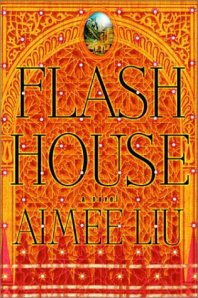
Aimee Liu is author of the novels Flash House, Cloud Mountain, and Face. Her nonfiction includes Gaining: The Truth about Life After Eating Disorders, and a memoir, Solitaire. She earned her MFA from Bennington College and now teaches in Goddard College’s MFA in Creative Writing Program. This piece is adapted from a longer essay on her blog: http://www.aimeeliu.net/blog.htm.
Q&A with Graphic Designer Julie Metz: Judging a Book by its Cover, Part 2
Earlier this week I posted Part 1 of this conversation with book designer Julie Metz on what makes a successful cover. Here’s the rest.
What should writers know about how to get their ideas across to a book designer? Writers who have labored over their books for years might be horrified to know that designers do not always have an opportunity to read their manuscripts before designing the cover. This is a result of scheduling and the sheer volume of work required of art departments. I often think it would be helpful to have authors write a short description of their book, not like the teaser ad copy we designers get on tip sheets, but a true synopsis that also identifies recurring imagery and themes. Writers are in the word business, but designers are in the image business. The author knows what her own images and themes are better than anyone else. That said, once those ideas have been successfully communicated, designers love to have the freedom to work with those ideas in ways that might surprise and delight an open-minded author.
 Can you give examples of some book covers you particularly like? Just a very few of the smart, clever covers I personally admire include all of David Sedaris, Lorrie Moore’s Birds of America, Nabokov’s Short Stories, J.M. Coetzee’s all-white novels (stark, spare, just like his writing). I have a small but cherished collection of book covers designed by greats like Paul Rand and Alvin Lustig. And then there are classics like Catch-22. The original cover design still looks modern and eye-catching.


Women writers I know sometimes lament that publishers want to make their book covers too “chick litty” — that is, ultra-feminine, with soft colors and pretty-pretty designs. Publishers counter that they want to sell books. What do you think of this ongoing debate? A huge proportion of book buyers are women, so it certainly makes sense for publishers and booksellers to market to this audience, though at times it seems as if books are being packaged like cosmetics. I have designed my share of true chick-lit covers! Some books clearly fit right in to this category of light entertainment and are well served by light and bright (and pink!) packaging. It’s too bad when a more literary novel ends up too pink and perky. So I can imagine that many women authors feel that the marketplace is dumbing down their work.
What makes a bad book cover? Too much cleverness can confuse book buyers. Cluttered or just plain ugly turns them away. Bland, tired, clichéd – ditto.
Have you ever had an author who vehemently didn’t like a cover you designed? If so, who won that battle, and why? Over the course of twenty working years, that scenario has happened at least a dozen times. My job is to be resilient in the face of rejection, not get too attached to my work, and remember that I am in a service industry! Once, many years ago, an author and editor killed a job I designed that the art director and I loved. “An award winner,” he said (we graphic designers live for those awards). I hung up the phone and cried. After I calmed down, I decided that it was time to grow a tougher skin, and I did. Another time I was called in to meet with a very famous author (who shall remain nameless) who spoke rudely about our efforts to create a cover for one of his novels. I grew even thicker skin. Now I try to cultivate some Buddhist-style detachment: I do my very best work and then release it to my client. I try to have a good attitude, and I try to make my art director’s job easy.
How important do you think a book cover is, ultimately, to the success of a book? In this era, marketing and packaging are extremely important. The cover needs to be strong enough so that when it appears at the size of a postage stamp in a magazine or online review it will still have some impact. But the truth is that while a bad cover may harm sales of a worthy book, and a great cover can help sales of a good book, a great cover will not sell a bad book.
- « Previous Page
- 1
- …
- 10
- 11
- 12
- 13
- 14
- …
- 19
- Next Page »
